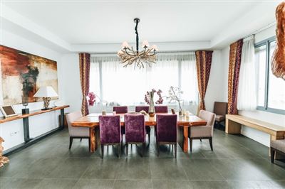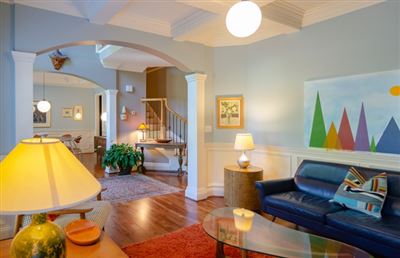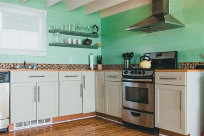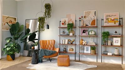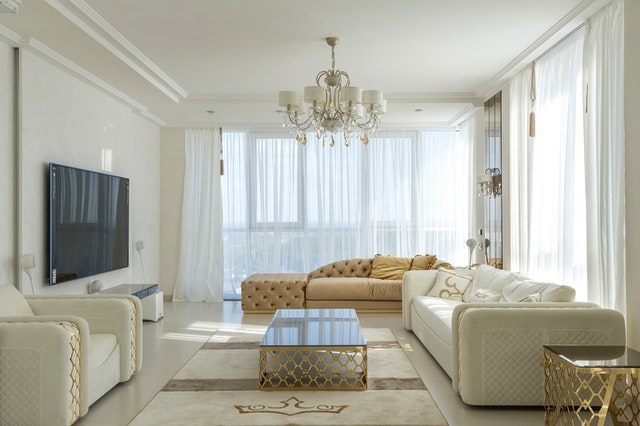
This home will shock you as soon as you enter the home. The five-and-a-half-meter-high living room makes you feel like you have walked into an empty and comfortable space, and your breathing becomes smoother.
Looking carefully, this peaceful and comfortable atmosphere comes from four white landing. There is no too much color or too much decoration in this home, so simple it seems that there is nothing that can be reduced. The chandelier in the living room is actually an explosion-proof lamp from the factory, which is cheap and practical; at the corner of the stairs, there is a black and white fire extinguisher changed into a zebra skin, which is very eye-catching against the white wall.
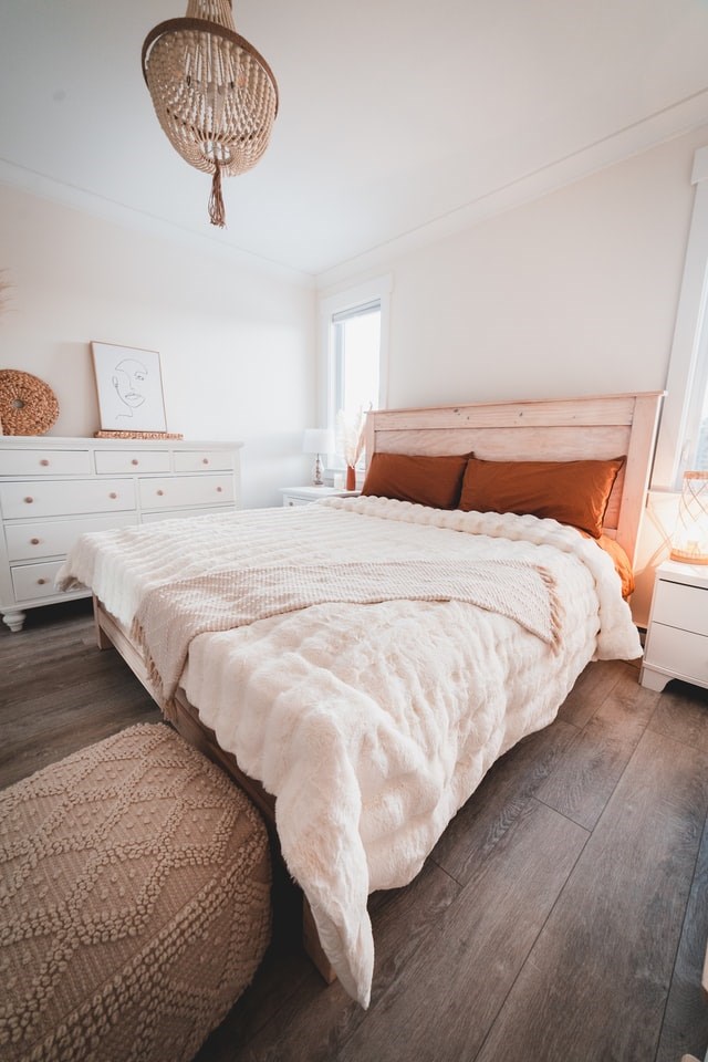
Faced with such a simple scene, it is hard to believe that the owner of this home is a top-notch graphic designer. He designed this home to be simple and distinctive. His principle is that it is best not to have too many traces of decoration. He believes that the material itself is decoration, and the structure itself is also decoration. He is more inclined to "unfinished state" for many things. From the living room where you enter, you can see the kitchen at the end and the studio upstairs at a glance, just as he said: it is a little unfinished.
In the studio on the second floor, the iron fence that was originally adjacent to the high-rise space was transformed into a wooden bookshelf, which naturally encloses a working and reading area. Books and accessories are randomly placed on the bookshelves. Since the back of the bookshelves is not backed, light and air circulate freely. A water pipe parallel to the beam above the bookshelf is made as a structure, deliberately exposed outside. A water pressure gauge with no function is installed at one end of the water pipe, which is a bit showy. The workbench is made according to the needs of the space. The wall uses the cheapest cement board, and the ground is self-leveling, but it uses a lighter color, which forms a good transition with the white bookshelves and gray cement wall boards. Strictly speaking, this studio where people can stay in for a long time is just a study room.
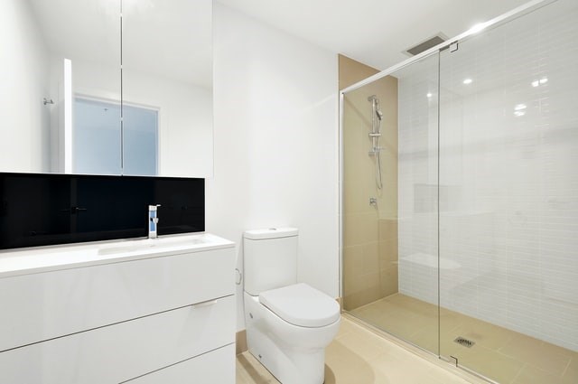
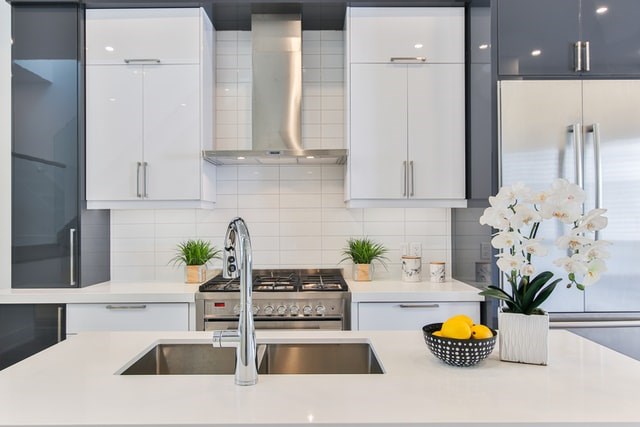
Apart from white, gray and a little green of plants, there are few other colors in the home, and they are relatively single. The two colors of gray and white are the main colors of the home. There is a quietness in the simple and elegant tone, and it shows a little extraordinary in the simplicity. The owner said that the white walls and gray floors are mild in color and highly compatible. No one, the space is static, and all the objects stay there quietly. People are the flowing colors in the space, connecting and combining different spaces, and at the same time there is a story.
In this simple home, traces of "unfinished" can be seen everywhere.
